Exploratory Data Analysis
I love coding I am a data scientist
Exploratory data analysis (EDA) is used by data scientists to analyze and investigate data sets and summarize their main characteristics, often employing data visualization methods. It helps determine how best to manipulate data sources to get the answers you need, making it easier for data scientists to discover patterns, spot anomalies, test a hypothesis, or check assumptions.
EDA is primarily used to see what data can reveal beyond the formal modeling or hypothesis testing task and provides a better understanding of data set variables and the relationships between them. It can also help determine if the statistical techniques you are considering for data analysis are appropriate. Originally developed by American mathematician John Tukey in the 1970s, EDA techniques continue to be a widely used method in the data discovery process today.
Why is exploratory data analysis important in data science?
The main purpose of EDA is to help look at data before making any assumptions. It can help identify obvious errors, as well as better understand patterns within the data, detect outliers or anomalous events, find interesting relations among the variables.
Data scientists can use exploratory analysis to ensure the results they produce are valid and applicable to any desired business outcomes and goals. EDA also helps stakeholders by confirming they are asking the right questions. EDA can help answer questions about standard deviations, categorical variables, and confidence intervals. Once EDA is complete and insights are drawn, its features can then be used for more sophisticated data analysis or modeling, including machine learning.
Exploratory data analysis tools
Specific statistical functions and techniques you can perform with EDA tools include:
Clustering and dimension reduction techniques, help create graphical displays of high-dimensional data containing many variables.
Univariate visualization of each field in the raw dataset, with summary statistics.
Bivariate visualizations and summary statistics allow you to assess the relationship between each variable in the dataset and the target variable you’re looking at.
Multivariate visualizations, for mapping and understanding interactions between different fields in the data.
K-means Clustering is a clustering method in unsupervised learning where data points are assigned into K groups, i.e. the number of clusters, based on the distance from each group’s centroid. The data points closest to a particular centroid will be clustered under the same category. K-means Clustering is commonly used in market segmentation, pattern recognition, and image compression.
Predictive models, such as linear regression, use statistics and data to predict outcomes.
Some of the most common data science tools used to create an EDA include:
Python: An interpreted, object-oriented programming language with dynamic semantics. Its high-level, built-in data structures, combined with dynamic typing and dynamic binding, make it very attractive for rapid application development, as well as for use as a scripting or glue language to connect existing components. Python and EDA can be used together to identify missing values in a data set, which is important so you can decide how to handle missing values for machine learning.
R: An open-source programming language and free software environment for statistical computing and graphics supported by the R Foundation for Statistical Computing. The R language is widely used among statisticians in data science in developing statistical observations and data analysis.
TYPES OF EXPLORATORY DATA ANALYSIS:
Univariate Non-graphical
Multivariate Non-graphical
Univariate graphical
Multivariate graphical
1. Univariate Non-graphical: this is the simplest form of data analysis as during this we use just one variable to research the info. The standard goal of univariate non-graphical EDA is to know the underlying sample distribution/ data and make observations about the population. Outlier detection is additionally part of the analysis. The characteristics of population distribution include:
Central tendency: The central tendency or location of distribution has got to do with typical or middle values. The commonly useful measures of central tendency are statistics called mean, median, and sometimes mode during which the foremost common is mean. For skewed distribution or when there’s concern about outliers, the median may be preferred.
Spread: Spread is an indicator of what proportion distant from the middle we are to seek out the find the info values. the quality deviation and variance are two useful measures of spread. The variance is that the mean of the square of the individual deviations and therefore the variance is the root of the variance
Skewness and kurtosis: Two more useful univariates descriptors are the skewness and kurtosis of the distribution. Skewness is that the measure of asymmetry and kurtosis may be a more subtle measure of peakedness compared to a normal distribution
2. Multivariate Non-graphical: Multivariate non-graphical EDA technique is usually wont to show the connection between two or more variables within the sort of either cross-tabulation or statistics.
For categorical data, an extension of tabulation called cross-tabulation is extremely useful. For 2 variables, cross-tabulation is preferred by making a two-way table with column headings that match the amount of one-variable and row headings that match the amount of the opposite two variables, then filling the counts with all subjects that share an equivalent pair of levels.
For each categorical variable and one quantitative variable, we create statistics for quantitative variables separately for every level of the specific variable and then compare the statistics across the number of categorical variables.
Comparing the means is an off-the-cuff version of ANOVA and comparing medians may be a robust version of one-way ANOVA.
3. Univariate graphical: Non-graphical methods are quantitative and objective, they are not able to give the complete picture of the data; therefore, graphical methods are used more as they involve a degree of subjective analysis, also are required. Common sorts of univariate graphics are:
Histogram: The foremost basic graph is a histogram, which may be a barplot during which each bar represents the frequency (count) or proportion (count/total count) of cases for a variety of values. Histograms are one of the simplest ways to quickly learn a lot about your data, including central tendency, spread, modality, shape and outliers.
Stem-and-leaf plots: An easy substitute for a histogram may be stem-and-leaf plots. It shows all data values and therefore the shape of the distribution.
Boxplots: Another very useful univariate graphical technique is the boxplot. Boxplots are excellent at presenting information about central tendency and show robust measures of location and spread also providing information about symmetry and outliers, although they will be misleading about aspects like multimodality. One of the simplest uses of boxplots is within the sort of side-by-side boxplots.
Quantile-normal plots: The ultimate univariate graphical EDA technique is the most intricate. it’s called the quantile-normal or QN plot or more generally the quantile-quantile or QQ plot. it’s wont to see how well a specific sample follows a specific theoretical distribution. It allows the detection of non-normality and diagnosis of skewness and kurtosis
4. Multivariate graphical: Multivariate graphical data uses graphics to display relationships between two or more sets of knowledge. The sole one used commonly may be a grouped barplot with each group representing one level of 1 of the variables and every bar within a gaggle representing the amount of the opposite variable.
Other common sorts of multivariate graphics are:
Scatterplot: For 2 quantitative variables, the essential graphical EDA technique is that the scatterplot, so has one variable on the x-axis and one on the y-axis and therefore the point for every case in your dataset.
Run chart: It’s a line graph of data plotted over time.
Heat map: It’s a graphical representation of data where values are depicted by color.
Multivariate chart: It’s a graphical representation of the relationships between factors and response.
Bubble chart: It’s a data visualization that displays multiple circles (bubbles) in a two-dimensional plot.
In a nutshell: You ought to always perform appropriate EDA before further analysis of your data. Perform whatever steps are necessary to become more conversant in your data, check for obvious mistakes, learn about variable distributions, and study relationships between variables. EDA is not an exact science- It is very important!
Exploratory Data Analysis in Python
What is Exploratory Data Analysis (EDA)?
EDA is a phenomenon under data analysis used for gaining a better understanding of data aspects like:
– main features of data
– variables and relationships that hold between them
– identifying which variables are important for our problem
We shall look at various exploratory data analysis method:
Descriptive Statistics, which is a way of giving a brief overview of the dataset we are dealing with, including some measures and features of the sample
Grouping data [Basic grouping with the group by]
ANOVA, Analysis Of Variance, is a computational method to divide variations in observations set into different components.
Correlation and correlation methods
The dataset we’ll be using is the child voting dataset, which you can import in python as:
- Python3
|
Descriptive Statistics
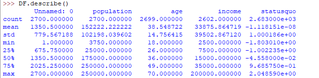
Descriptive statistics is a helpful way to understand the characteristics of your data and to get a quick summary of it. Pandas in python provide an interesting method description(). The describe function applies basic statistical computations on the dataset like extreme values, count of data points standard deviation etc. Any missing value or NaN value is automatically skipped. describe() function gives a good picture of the distribution of data.
Advertisement
- Python3
|
Here’s the output you’ll get on running the above code:
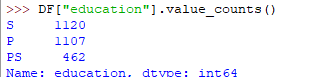
Another useful method Is value_counts() which can get a count of each category in a categorical attributed series of values. For an instance suppose you are dealing with a dataset of customers who are divided into youth, medium and old categories under column name age and your data frame is “DF”. You can run this statement to know how many people fall into respective categories. In our data set example education column can be used
- Python3
|
The output of the above code will be:
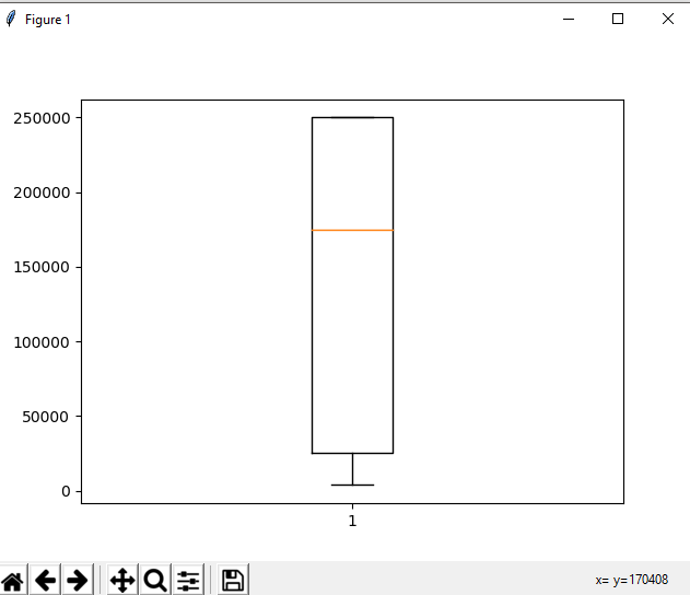
One more useful tool is a boxplot which you can use through matplotlib module. Boxplot is a pictorial representation of the distribution of data which shows extreme values, median and quartiles. We can easily figure out outliers by using boxplots. Now consider the dataset we’ve been dealing with again and let's draw a boxplot on the attribute population
- Python3
|
The output plot would look like this with spotting out outliers:
Grouping data
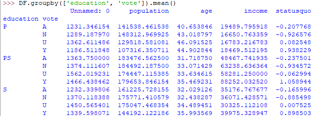
Group by is an interesting measure available in pandas that can help us figure out the effect of different categorical attributes on other data variables. Let’s see an example on the same dataset where we want to figure out the effect of people’s age and education on the voting dataset.
- Python3
|
The output would be somewhat like this:
If this group by output table is less understandable further analysts use pivot tables and heat maps for visualization on them.
ANOVA
ANOVA stands for Analysis of Variance. It is performed to figure out the relation between the different groups of categorical data.
Under ANOVA we have two measures as result:
– F-test score : which shows the variation of group mean over variation
– p-value: it shows the importance of the result
This can be performed using python module scipy method name f_oneway()
Syntax:
These samples are sample measurements for each group. In conclusion, we can say that there is a strong correlation between other variables and a categorical variable if the ANOVA test gives us a large F-test value and a small p-value.
Correlation and Correlation computation
Correlation is a simple relationship between two variables in a context such that one variable affects the other. Correlation is different from the act of causing. One way to calculate correlation among variables is to find Pearson correlation. Here we find two parameters namely, the Pearson coefficient and p-value. We can say there is a strong correlation between two variables when the Pearson correlation coefficient is close to either 1 or -1 and the p-value is less than 0.0001.
Scipy module also provides a method to perform correlation analysis, syntax
Here samples are the attributes you want to compare.
This is a brief overview of EDA in python, we can do lots more! Happy digging!